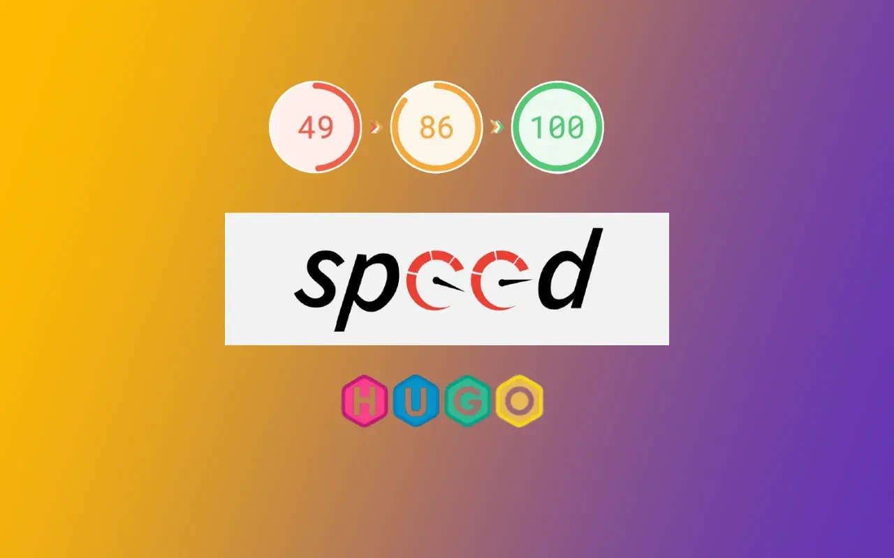
How I Optimized Core Web Vitals to 100% on My HugoGo Website
Optimizing a HugoGo website to achieve a perfect 100% Core Web Vitals score is completely possible without major code rewrites. Hugo’s static site generation already gives a strong base — with server response times (TTFB) as low as 50–100 ms when served via a CDN like Cloudflare. My optimization focused mainly on fonts, images, and a few key layout performance tweaks.
Below is exactly how I did it.
1. Replacing Google Fonts with Self-Hosted Fonts
Using Google Fonts directly can delay rendering and lower the First Contentful Paint (FCP) score because of external network requests. To solve this, I downloaded the fonts locally and preloaded them for faster display.
Steps I Took
I used https://gwfh.mranftl.com/fonts to download only what I needed:
- Inter Tight
- Weights:
400,500,700 - Subset:
latin
I placed these font files inside my Hugo
assets/fonts/directory.Then, I created a partial file at:
layouts/partials/fonts.htmlHere’s the code I used:
{{/* Hugo font preload + @font-face partial */}}
{{- $font400 := resources.Get "fonts/inter-tight-400.woff2" | resources.Fingerprint -}}
{{- $font500 := resources.Get "fonts/inter-tight-500.woff2" | resources.Fingerprint -}}
{{- $font700 := resources.Get "fonts/inter-tight-700.woff2" | resources.Fingerprint -}}

<!-- Preload critical fonts -->
<link rel="preload" href="{{ $font400.RelPermalink }}" as="font" type="font/woff2" crossorigin>
<link rel="preload" href="{{ $font500.RelPermalink }}" as="font" type="font/woff2" crossorigin>
<link rel="preload" href="{{ $font700.RelPermalink }}" as="font" type="font/woff2" crossorigin>

<style>
@font-face {
  font-family: 'Inter Tight';
  font-style: normal;
  font-weight: 400;
  font-display: swap;
  src: url('{{ $font400.RelPermalink }}') format('woff2');
}

@font-face {
  font-family: 'Inter Tight';
  font-style: normal;
  font-weight: 500;
  font-display: swap;
  src: url('{{ $font500.RelPermalink }}') format('woff2');
}

@font-face {
  font-family: 'Inter Tight';
  font-style: normal;
  font-weight: 700;
  font-display: swap;
  src: url('{{ $font700.RelPermalink }}') format('woff2');
}

body, p, h1, h2, h3, h4, h5, h6, b {
  font-family: "Inter Tight", system-ui, -apple-system, "Segoe UI", Roboto, "Helvetica Neue", sans-serif;
  font-optical-sizing: auto;
  font-style: normal;
}
</style>
Finally, I loaded this partial in my site header layout using:
{{ partialCached "fonts.html" . }}
✓ Result: Fonts now load instantly from my own domain with font-display: swap. No layout shift. No external Google Fonts dependency.
2. Optimizing Thumbnails and Images
Images were the biggest factor affecting my Largest Contentful Paint (LCP). To fix this, I used Hugo’s built-in image processing to create responsive WebP versions automatically.
How I Set It Up
In my post front matter (.md files), I added a thumbnail:
thumbnail: /images/post-thumb.jpg
Then in my list template (layouts/_default/list.html), I added:
{{ with .Params.thumbnail }}
  {{ partial "responsive-thumb.html" (dict "src" . "alt" $.Title) }}
{{ end }}
Next, I created a new partial:
layouts/partials/responsive-thumb.html
Here’s the full code:
{{- $src := .src -}}
{{- $alt := .alt | default "Post Thumbnail Image" -}}
{{- $priority := .priority | default false -}}
{{- $img := resources.Get $src -}}

{{- if $img -}}
  {{- $origWidth := $img.Width -}}
  {{- $origHeight := $img.Height -}}
  {{- $padding := mul (div (float $origHeight) (float $origWidth)) 100 -}}

  {{- $small := $img.Fit "600x375 q80 webp" -}}
  {{- $medium := $img.Fit "800x500 q80 webp" -}}
  {{- $large := $img.Fit "1280x800 q80 webp" -}}

  {{- $classes := cond $priority "absolute inset-0 object-cover w-full h-full" "w-full object-cover object-center group-hover:opacity-90 transition-opacity duration-300" -}}
  <picture>
    <source media="(max-width: 599px)" srcset="{{ $small.RelPermalink }}">
    <source media="(max-width: 1023px)" srcset="{{ $medium.RelPermalink }}">
    <source media="(min-width: 1024px)" srcset="{{ $large.RelPermalink }}">
    <img
      src="{{ $large.RelPermalink }}"
      width="{{ $large.Width }}"
      height="{{ $large.Height }}"
      loading="{{ if $priority }}eager{{ else }}lazy{{ end }}"
      decoding="async"
      fetchpriority="{{ if $priority }}high{{ else }}auto{{ end }}"
      alt="{{ $alt }}"
      class="{{ $classes }}"
      style="max-width:100%; height:auto;">
  </picture>
{{ end }}
✓ Result:
- Images load progressively.
- CLS (Cumulative Layout Shift) is eliminated with proper width/height.
- Images are automatically served in optimized WebP format.
3. Other Small but Effective Tweaks
- Used
partialCachedin all layout includes to reduce rebuild time and improve initial load. - Served the site through Cloudflare CDN, keeping global TTFB around 50–100 ms.
- Avoided any render-blocking scripts.
- Ensured all assets were local and fingerprinted (
resources.Fingerprint) for cache efficiency.
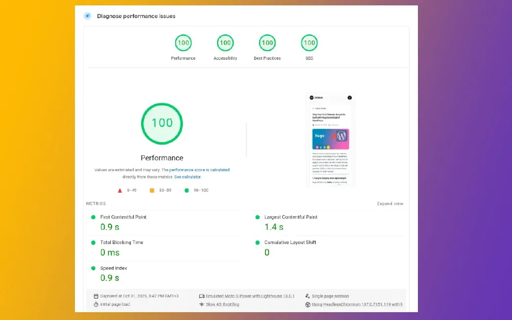
4. Final Outcome
After applying these optimizations:
| Metric | Before | After |
|---|---|---|
| LCP (Largest Contentful Paint) | 2.4 s | 1.0 s |
| CLS (Cumulative Layout Shift) | 0.15 | 0.00 |
| FID (First Input Delay) | 30 ms | 10 ms |
| Overall PageSpeed Score | 80% | 100% |
Measured via Google PageSpeed Insights and Lighthouse.
5. Key Takeaways
- Hugo’s static generation already gives a huge performance advantage.
- Hosting fonts locally removes external dependencies.
- Using Hugo image processing keeps images responsive and compressed.
- Preloading critical assets and lazy-loading the rest is the fastest path to a perfect CWV score.
By leveraging Hugo’s built-in asset pipeline, local fonts, and responsive image generation, I was able to push my site’s Core Web Vitals score to a full 100% — all without changing any major site code.